Guide To Making Comedy Show Flyers
If you are a comedian, then there’s one thing that I know we all have in common. We have social media timelines that are entirely too full of comedy posters.
I scrolled Instagram for 60 seconds today and counted 14 different posters for 14 different shows happening this weekend. There are so many posters that we often start to ignore them and the only ones that truly stand out are the bad ones. And trust me, there are plenty of bad ones.
So how do you avoid having your show poster be one of the cringey ones? Do you need a degree in graphic design or an expensive Photoshop account? Nope. Not at all. A simple free (or pro if you can swing the $15 a month) Canva account is plenty to get you started.
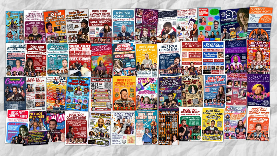
I’ll show you some guidelines of what makes a good and bad poster. What makes me an expert? Well, I’m not. But I’ve made hundreds of posters, get paid to do it and both of the shows I produce bring out hundreds of people. Maybe I’m onto something. Here’s every Duck Foot Comedy Night poster I’ve made in the last three years.

Not every poster will be the same, and that’s awesome. Overwhelming the reader with information can be a turn off and confusing. Sometimes, a lot of the time, less is more. Especially in design.

Let’s start off with the things EVERY comedy show poster should have at a minimum.
Non-Negotiables
- Show Name
- Location
- Price (or Free)
- How to Get Tickets
- Date and Time (Including Day of Week)
Having these five elements I call the Non-Negotiables are essentially the Who, What, Where, Why, When. Get this info out there and you’ve got the basics down. People are aware of a comedy show and know when and where it is. Congratulations! You’ve achieved the absolute bare minimum.

Next up let’s add some info to make it more enticing. These are items you can include if you think they’ll help out butts in seats.
Necessary If Applicable
- Headliner Name
- Lineup Names
- Photos of Headliner and Lineup
- Headliner Credits
- QR Code to Tickets
- Time of Doors
- Address (if needed)
- Producer
Some shows will sell their lineup especially if they are asking the comedians to share the poster.
Has your headliner been on a TV show or a notable comedy festival? Put it on the poster!
A QR code is a great way to get tickets or sign ups if the poster is printed. I recommend going to a linktree or other service with ticket links as well as the show’s or producer’s socials.
Choose a professional headshot of the Headliner if they have one, and make sure they are the focus of the poster. If there is no headliner and it is more of a showcase show, then let everyone be the same size.
If you have a unique location or if your ticket link provides the address, you can probably leave that off.
If you have a specific time for “doors” include that as well. You don’t want folks there an hour early if you’re only letting them in 30 minutes prior to the show.

Nice To Have But Not Necessary
- Photo of the Show
- Blurb About the Show/ Show Credits
- Food and Drink Availability
- Drink Minimum or BYOB
- Age Restrictions
- Clean or Dirty Show
Finally, let’s look at some things that can be overkill but might be situationally good for your show.
Is your show in a place with food and beverages available and that’s not completely obvious from the name? Let people know!
Is there a drink minimum or is it a secret show with a BYOB policy? If it is 21+ you might want to make that clear, also with clean or especially dirty shows. Most people assume comedy will be dirty to an extent.
Would a photo really sell the scope and vibe of the show? Then include one!
Checklist For What Every Show Flyer Needs
Non-Negotiables
- Show Name
- Location
- Price (or Free)
- How to Get Tickets
- Date and Time (Including Day of Week)
Should Have But Optional
- Headliner Name
- Lineup Names
- Photos of Headliner and Lineup
- Headliner Credits
- QR Code to Tickets
- Time of Doors
- Address (if needed)
- Producer
Nice To Have But Not Necessary
- Photo of the Show
- Blurb About the Show/ Show Credits
- Food and Drink Availability
- Drink Minimum or BYOB
- Age Restrictions
-
Clean or Dirty Show
At the end of the day your goal is to get butts in seats and put on a comedy show that you can be proud of. The very start of that comes from that first poster. Let’s go over some cliches you should avoid as well. Check out this hilarious Facebook group with lots of terrible poster examples: Bad Comedy Flyers
Comedy Poster Cliches
- Red Curtains
- Brick Wall
- Canva Templates
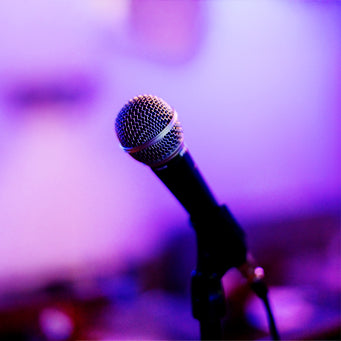
- Old Timey Microphone
- Too Many Comedians
- Missing Information
- Awkward Spacing
- Noisy and Distracting Background
- Poorly cut out comedians (Use frames if that’s the case)
Finally, if you aren’t great at making posters… Ask for help! I’m always down to share some pointers or critique what you have so far. If you still can’t do it, hire someone!
Remember: a good poster goes a long way but a bad poster goes even further! Here are some final tips on making your poster!
Technical Tips for Making a Poster
- Use 1:1 or 4:5 ratio for Instagram
- Leave room for things to breathe. Don’t over clutter.
- Use qrcode-monkey.com to make free permanent QR Codes
- Use Canva as a free program for creating flyers
- Simple colors or gradients for backgrounds
- Use frames for comedians if you can’t get their pictures to cut out cleanly
- Choose simple Sans Serif fonts that are bold and easy to read
- Show it to a non-comedian friend for feedback. See what they feel might be missing.